This time next week Santa will have come and gone. Yesterday, though, in my final Playwrights Playground class of this session, some students proxied Santa in with cupcakes, Hershey’s kisses, and one beautifully wrapped gift that quickly found its way under the tree. Gaia and Odin gave it a quick sniff, didn’t tell me what’s inside, and ran outside to pee. Dogs are great at keeping secrets.
Wishing all of you a lovely holiday!
Now let’s get to it—
Storytelling Tip o’ the Week
Thank you to sharp-eyed reader Michael B. for forwarding me an article from the Washington Post.
You’ll remember last week I geeked out big-time over the scenic design in Home Alone. And Michael happened to see an interview with Eve Cauley, who was the set decorator for the film! She is now a professor at the University of North Carolina School for the Arts, and her takes on the storytelling power of scenic design are awesome.
(note: everything in quotes is from Eve Cauley; content below borrowed and edited from the article/interview)
“It was a bigger job than most people realize, because we did not film inside the now-famous Home Alone house at all. What the audience saw as the home’s interior settings were all built sets.”
“I knew [writer and producer] John Hughes preferred an American, upper middle class traditional look. He did not like much aging on furniture or anything else. He liked his audiences to feel entertained when they went to the movies. He wanted to uplift the audience to feel happy after they left the theatre. To me, this was a warm, well-intentioned gift he gave to the world.”
Those design discussions led to an aesthetic resembling Colefax and Fowler, the famed British fabric and wallpaper company, only with a Midwestern flair.
Cauley picked out the wallcoverings, décor, furniture (including upholstery fabric), accessories, and everything else that appeared on those sets. As when decorating a real home, she began with the big items — furniture, rugs, lamps. She sketched out the placement of the furniture beforehand because she had to place couches and chairs in places that worked with the movement of the actors that the director had staged.
Cauley’s favorite part of scenic design, though, is what she calls the third layer, which consists of “tiny details of décor that make a set appear to be real. It may be a pile of mail on a table, socks on the floor in a bedroom, clutter, or a little container of fish food by a fishtank.”
She would even wear down a bar of soap, so it looks used and lived with, rather than straight out of a package. (I learned this same level of detail from Dr. Keener at Greenville College when she explored one of my sets. First thing she did? Scuffed the doorknob and doorjam to make it look lived in!)
Because the Home Alone house is full of kids, Cauley’s third layer also included multiple moments that made it appear like someone started a task, then got distracted before finishing: a wedged screwdriver over the workbench in the basement and a table with scraps of wrapping paper, tape, and scissors in the primary bedroom. “Those tiny human-created details with decorating make a place look real to the audience.”
Cauley also puts herself in the characters’ shoes when she is filling the set with items beyond what the script includes: “I imagine what the inhabitants might have bought, who in the story would have decorated the home or location if it were real, what time period the décor would have been from, gifts they might have received and … art they may have created and kept in their room. I think of how tall the person who lives in a house is when hanging their art on their walls. I unify it all visually with a color palette that feels appropriate for the story and supports the emotions the screenwriter would like the audience to feel at any given point.”
While someone watching the movie will get a yuletide vibe from the house on screen, that person may not realize the full scope of the color scheme. Indeed, the entire place is decked out in holiday colors, down to the green countertops and red cookware in the kitchen. “I selected reds, golds, and greens in the wallpapers and upholstery, to feel warm to the audience.” Meanwhile, scenes taking place elsewhere adopted a cooler color palette. That way, the family reunion at the end in the home felt even warmer.
All of this is happening somewhat below the surface. “I pictured a flip book, where the pages go by very quickly. The colors would need to be strong to be caught by the eye within all the moving frames.” So Cauley would have small pops of bright color, like poinsettias. “I call that ‘punctuation’ of bright colors within a more muted overall frame of color. It worked. Audiences didn’t think about my color palette but felt it.”
And this level of detail extends to collaborating with the other designers. Cauley didn’t design the costumes, but check it out…
“I like to keep wallpapers or wall paint colors just a little less intense in color than the costumes, so one’s eye is directed to the actors.”
(And this might be one of my favorite storytelling in 3D details…)
When it came to the exteriors, Cauley paid careful attention to the Christmas lights her crew installed throughout the neighborhood. She varied the colors and sizes for visual interest, and then ensured that “the lights on the main house were shining just a bit brighter than the rest on the street, so the audience’s eye (and the burglars!) would be directed in a subtle way to the main home in the story.”
Shout out!
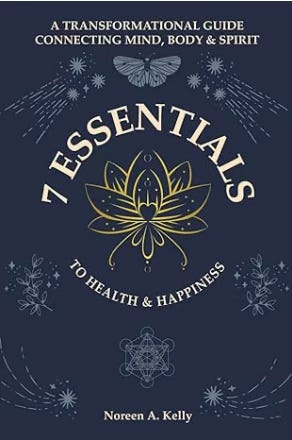
I had the great honor of working as an editor and coach for Noreen Kelly on her newly published book: 7 ESSENTIALS TO HEALTH & HAPPINESS: A Transformational Guide Connecting Mind, Body & Spirit.
Here’s part of the blurb—
This is not just another wellness book; it serves as a roadmap for transformation. Noreen's distinctive fusion of personal experiences, professional insights, and practical wisdom provides readers with a clear path through the maze of conflicting health information. Whether you are grappling with chronic health challenges, feeling stagnant in life, or simply aiming for enhanced well-being, The 7 Essentials offers a framework for enduring change
You can learn more about 7 ESSENTIALS and get it as a paperback or ebook by clicking the purple button!
The Page&Stage Podcast: Courting Serendipity
The current episode features award-winning author and academic Deborah Pike. We talk about her debut novel, The Players, and she traces her journey from Australia to Paris, explaining how her traits as an author were nurtured through her experiences in diverse environments. Deb emphasizes that travel stimulates an author's creativity by opening them to new experiences and evokes a child-like curiosity which ultimately helps in character creation and storytelling.
Thanks as always for reading, and have a great weekend!
Jason “Doorknob Scuffer” Cannon


